Peter Jobes
Definition of Call-to-action (CTA)
A call-to-action (or CTA) is a button/widget/box that wakes the reader up from their passive reading and makes them do something. Usually to make a call for a quote or sign up to a mailing list. CTAs are often characterised by standing out very vividly against the rest of the content.
Call-to-action prompts are considered as vital in marketing a product or service on business websites. The aim is to offer the visitor the chance to make a decision to engage further with the page, with the goal of receiving an enquiry or making a sale.
Without a call-to-action, a website risks losing a visitor that otherwise wouldn’t engage with the site.

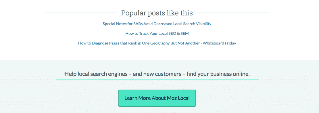
Call-to-actions can take many forms. From large pop-ups that often force the reader to click a button before continuing to access the whole of the website (usually taking the shape of a ‘Continue to site’ hyperlink), to the more understated approaches. Above we see Moz’s call-to-action. Moz has chosen a more discreet approach which can be found at the bottom of their articles – deploying a call-to-action here has an increased success rate because it’ll be primarily visible to readers who have just finished reading a post, offering satisfied readers the opportunity to learn more.
Creating an effective call-to-action is a tricky business in itself, with myriad theories and science behind the approaches that draw a visitor in to make that all-important click. Many consider creating an outstanding colour scheme to lure attention to the action button (as can be seen with Moz’s use – the colour scheme changes to an aqua background that guides our eyes down to the bright aqua button). It’s also considered important to not draw too much attention away from the call-to-action by using attention-stealing images in the reader’s line of sight. Often using pictures of peoples’ faces alongside a call-to-action is seen as too much of a distraction that draws viewers away from the attraction of the button – however, it’s also commonly accepted that using an image of a person’s face that’s looking towards the action button helps guide a visitor to the call-to-action.
Tip: It pays to have a good call-to-action in your site. Make sure it clearly and succinctly explains what the visitor will get by clicking to ‘find out more’ or ‘make an enquiry’. Try to come use an attention-grabbing colour scheme without intruding too heavily on the audiences’ experience of your website.
Further Reading:
1. 12 Best Drag & Drop Landing Page Builders To Boost Conversions
2. 15 Most Common User Experience Issues (and how to fix them)

Peter Jobes
Content Marketing Manager

