
Dmytro Spilka
There are over 1 billion websites on the web, and the number growth rapidly.
Although it is relatively easy to create a simple website, the vast majority of website designers/developers are still making huge mistakes that result in a bad user experience and issues with functionality. Having a poorly designed & developed website can have an adverse effect on your brand, reputation and business as a whole. Your website acts as the main “field” of interaction with your visitor and potential client. Therefore, it is imperative to build a well-designed, well-structured and functional website to satisfy the need of the visitor, whether their intent is to find an answer or make a purchase.
Whether you are a Web Designer, Developer, Internet Marketer or SEO’er, the primary aim of this guide is to give you some useful tips on how to maximise the efficiency and productivity of your website.
Let’s get to the business.
1. Poor Search Engine Optimisation (SEO)
Okay, SEO can be challenging and time-consuming. However, there is no reason not to build a basic On-Page foundation that can help your business rank well. Usually, web designers & developers focus only on the design itself and spend little or no time on SEO. But hey, that’s a critical part of the sites’ performance, and your clients are going to appreciate your commitment and professionalism.
Recommendations:
- Ensure that every page on your website has a unique Meta Title (Approx. 55 characters long) and Meta Description (Approx. 100-155 characters long)
- Use H1-H6 (H1 should only be used once on a single page)
- Optimise Images and Visuals
- Produce useful and relevant content
- Use keywords in your content (don’t stuff them thought)
- Check your technical SEO (robots.txt, sitemaps, redirects and error page)
2. Internal Linking
Ensure that you have an appropriate internal linking system on your website. For example, if someone views one of your products, you may want to show them related products. Likewise, if someone views one of your services page, you’d like to add a link that leads them to the booking/contact page to complete the conversion.
Avoid broken links. Check that all of your links are pointing to valid and relevant URLs, if they don’t, repair them. Broken links can easily put people and search engines off.
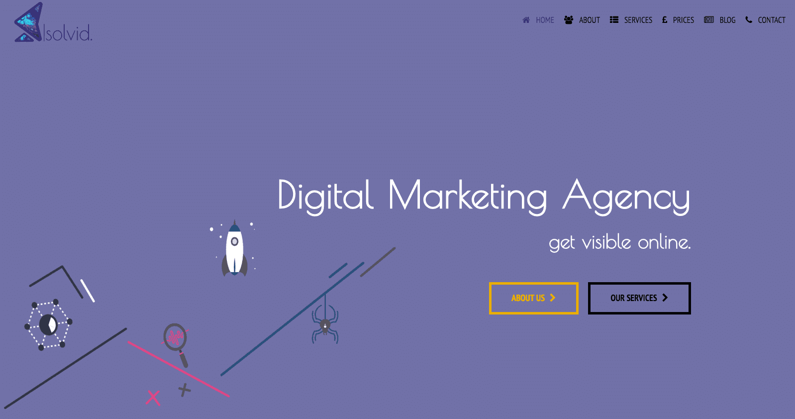
3. Unclear Message
One of the biggest problems that we see on daily basis is “unclear message”. As soon as the user lands on your site, they should instantly get an idea of what your website is about. If you are a Web Designer, you’d simply want to tell that. Don’t get too creative as this can easily confuse users.
Here is how our main page looks like, can you get an idea of who we are?
4. Navigation & Structure
Users wouldn’t usually want to make more than 3-4 clicks to get to the relevant page. Hence, every website should have a clear navigation. You can achieve that by using appropriate top-level pages and subpages. Instead of listing all of your pages in the main navigation panel, which is going to look untidy, try to categorise them under the relevant tabs. For example, list your services under the service tab. Simple, right? Not everyone follows that thought.
5. URL Structure
It is imperative to illustrate the hierarchy of your website to users and search engines. Instead of using page and post id, try to implement real words in every URL. If you are viewing “Services” page, use the following format: www.yourwebsite.com/services/. By using clear hierarchy, you are making it easier for the user to navigate and search engine to crawl your site.
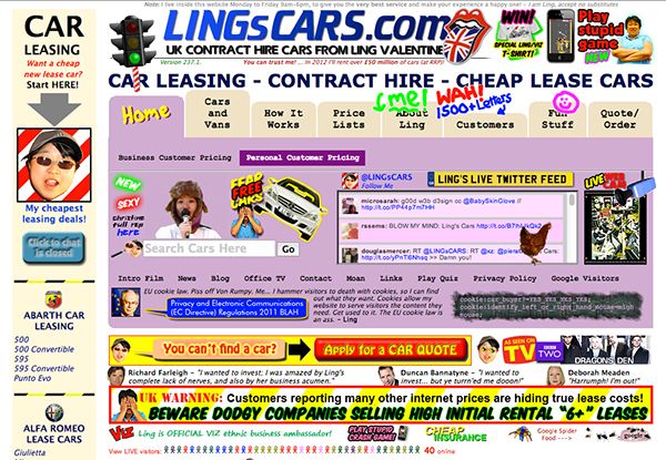
6. Too Many Call-to-Action
Using no Call-to-Action can be as bad as using too many. Having too many Call-to-Action may look spammy and unnatural, and eventually will make users wanting to leave your website. Ensure that your buttons are visible, but not too large.
Here is a visual example of what you shouldn’t do:
7. Too Much Content
Have you ever finished reading that huge piece of content that was published on the home page of the website? I bet you haven’t. Having paragraphs of text will not necessarily attract people, they simply have no time for that. That is one of the reasons why websites should start blogging, if you want to write a lot, use that content for your blog.
Every landing page should carry value to the viewer, it should explain exactly what you do and who you are, but only in few hundred words.
8. …Not Enough Content
Having too much content is an issue, but having not enough or no content at all is even worst. Try to have at least 300-400 words on every page of your website (only if it’s appropriate), you probably wouldn’t want to have too much content on you checkout page.
Remember! Your content should answer questions and be relevant to want you do. Don’t go round in circles by explaining the same thing all over again. Be unique and helpful.
9. Duplicate Content
Your content has to be unique and shouldn’t be copied from elsewhere. We know it’s hard, it takes time and hard work, but that is the way to go if you really want to stand out. Especially, duplicate content can be a pain for e-commerce sites, so try to write a descriptive and unique product descriptions.
Also, if you have a piece of content that is also available in a PDF printable version, you can put rel: canonical tag to avoid duplicate content.
You can use the following tools to identify internal duplicate content:
10. Low-Quality Visuals (Images, Animations and Videos)
Having quality images & visuals result in positive user experience and engagement while poor quality or irrelevant images can have a negative effect. It is important to ensure that your images fit well with your brand identify, and carry some value to your viewers.
11. Unoptimised Images
Every image on your site should include an Alt and Description tag, this way you can tell search engines a bit about the content of an image.
We already know that great images result in a positive website reputation, but we also know that quality images can have huge file sizes, which can result in speed deceleration of your site. Hence, if you want your website to load fast, image compression becomes a necessity.
You can use the following tool to compress images without losing much quality.
12. Website Load Speed
Recent researchers state that users would not want to wait for more than 5 seconds for your website to load. In fact, load speed is one of the many ranking factors, and an extremely slow site can hurt your rankings.
To maximise the speed of the website, you may want to follow the following points:
- Choose a quality Hosting Provider (My personal choice is Hostgator)
- Compress Visuals & Images
- Avoid using too many videos
- Minify CCS (get rid of the white space)
If you are using SSL extension, please try to avoid embedding badges like SiteLock. These create extra “handshakes” with the server, which can significantly slow down your website response time. For more tips on SSL Certificates, check the following article: https://moz.com/blog/seo-tips-https-ssl
Useful tools to test your website speed:
13. Mobile Friendliness & Responsiveness
You simply can’t ignore mobile search. If your website isn’t optimised for mobiles and doesn’t adjust to the screen size, that means you are losing out. Yes, it can be costly if you had your website built 10 years ago, but by investing in a mobile-friendly website you can expect an excellent customer satisfaction and competitive advantage.
Use this Google tool to test your mobile-friendliness:
14. Too Many Pop-Ups
Have you ever went to a website and realised that it was a bad idea in just a few seconds? We all have. Having an adequate number of pop-ups is absolutely normal. But if you have a pop-up that is followed by another pop-up, this can lead to a problem. Try to avoid using too many of these, as this can be very annoying.
15. Social Media Integration
This can be straightforward for some people, but I still see websites that are being active on social media and fail to integrate these with their website.
A simple solution is to add social links to your footer or the header (or both) and add social share buttons to your blog posts. Simple, right?
16. Useless 404 Page
How many times have you landed on a 404 error page? Did you find it useful? Have you been given a list of useful links? Or at least a “go back” button?
Many web designers don’t tend to spend time on designing the 404 page, which is a big mistake. Ensure that it directs people to some useful links.
17. Lack of Trust
Lack of trust & brand reputation can be a big deal, especially for new businesses. However, you can add some professionalism to your website by adding Privacy Policy, Terms & Conditions, Company Name and Number. These will definitely add some trustworthiness to your site.
18. Colours & Fonts
You should ideally use up to 3 different fonts and colours on a single web page. We all have access to hundreds of colours & fonts, and can be over artistic in some occasions, but that doesn’t mean we should use all of them at once.
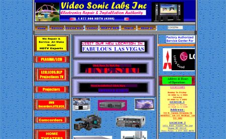
19. The 90s are gone…
The era of 90s web design is now gone, but I still see a number of websites that use terrible 3D headlines, put yellow text on a yellow background and so forth.
Here is how your site shouldn’t look like:
20. Unnecessary Badges
Great! You have a new badge, but who cares? Unless you’ve got a badge from an authority in your industry (e.g. Google or Bing), I would not recommend messing your website design with unnecessary badges.
21. Is this the right Logo design?
Your Logo is your identity, and therefore, it should fit well with your website design. I’ve seen many websites that have a well-designed site, but never bothered to change their logo design.
22. How do I get in Touch?
Please don’t hide your contact details in some unreachable page. Hiding your contact information can only result in bad user experience and lost clients.
As soon as the person is ready to get in touch, your email and telephone number should be in front of their face.
23. Why did you turn the music on? What if I’m in the library?
If you have videos or some kind of music background on your site, please let the user control that. Viewers can be frustrated when trying to find that magic “turn-off” button.
24. Thinking about Search Engines but not the users
Websites are built for human beings. It is always a good practice to optimise your site for search engines, but usability remains as your primary aim. If your website isn’t user-friendly, I can guarantee that you won’t rank well.
25. Do Search Engines see the same content as users?
I hope that you are not practising any dodgy SEO techniques, but it is important to mention that cloaking and hidden text are considered as heavy violations of Google guidelines.
To test whether search engines are seeing the same content, go to your website on SERPS (Search Engine Result Pages) and check the text cached version of your site.
26. Can’t use that contact form
Some contact forms can be too long and too challenging to submit. Only ask for the information that you intend to use.
What I also notice sometimes is that CAPTCHA can be hard to read. Therefore, I would suggest upgrading to Google reCAPTCHA.
27. Sitemap?
Have you submitted your sitemap to Google Search Console and Bing Webmaster Tools? You can find you sitemap by typing “www.yourwebsite.com/sitemap.xml”. Sitemaps help search engines crawling and indexing your site, especially if your website is new or/and has a lot of pages.
You should also create a user sitemap which will usually contain clickable links to different pages on your site.
28. Is your website indexable & sitemap reachable?
Ensure that you are not blocking search engines from crawling and indexing your site, you can do so by analysing your robots.txt file. Also, make sure that you don’t set “no-index, no-follow” to pages that you want to be indexed and followed.
29. Inappropriate Advertising
If you participate in Google Display Network (or any other advertising network) and allow ads to be displayed on your site, you would want to ensure that posted ads are relevant to your website, and do not contain inappropriate information.
30. Do you think I can click that button on the mobile as well?
Even though your website might be optimised for mobile, you would want to make sure that every clickable element on your desktop version is also clickable on mobiles.
31. Not everyone knows about cookies…
If you are using any tracking or remarketing tags on your site, you should include a Cookie Consent Pop-Up to notify users. You should also have a page that sets out the cookie policy.
32. What page I’m I on now?
Sometimes, people find it frustrating and hard to realise what page are they viewing at the moment. You can implement page titles, menu highlights and breadcrumbs to make it easier for them to navigate.
33. Too much in the Footer
Keep your footer clean and tidy. A typical footer would include:
- Address, Email and Telephone
- Useful Links (e.g. Privacy Policy, T&C Page, Sitemap and Cookie Policy)
- Social Media Links
- Your latest tweet or blog post
You would want to avoid stuffing anchor text links and unnecessary badges.
Conclusion
I hope that by using this post as a checklist, you will be able to fix or prevent these critical mistakes from ruining your website. It is vital to consider them seriously, as these points can determine the success of your website and business.
Remember! Websites are built for people, with search engines in mind, not the other way around. Ensure that your viewers leave your site with a smile on their face (although you won’t be able to see that). Satisfaction and experience is the biggest asset that your website can hold.
Dmytro Spilka
Head Wizard
 194 customers signed up in the last 30 days